Wellesley Professor’s Data Visualization App Helps Users Create Compelling Graphs

Every day, we are bombarded with information. How can we best separate facts or plausible arguments from misrepresentations and misunderstandings?
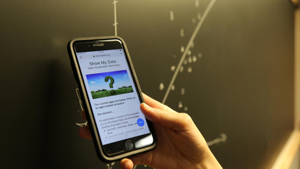
For Jeremy Wilmer, associate professor of psychology and director of the Human Variation Lab at Wellesley, the answer lies partly in high-quality visual presentation of data. With Wilmer’s new suite of free, web-based data visualization apps, called ShowMyData, users can produce a graph or series of graphs in seconds on a computer or smartphone just by copying and pasting data from a spreadsheet program and customizing a few options. The graphs can then be converted to a high-resolution format, such as a PDF, for closer examination, presentation, or publication.
Wilmer has long been interested in innovative, informative visual presentations of data. Inspired by other creative web data visualization projects—such as Wellesley assistant professor of environmental studies Alden Griffith’s Data Explorer—Wilmer began to learn about new web programming resources, and he combined his expertise in human perception and cognition with new coding skills to build ShowMyData.
“ShowMyData’s mission is to improve the accuracy of evidence-based discourse—in science, policy, business, medicine, education, and other domains—by putting simple, elegant, powerful, best-practice data visualization tools at everyone’s fingertips,” said Wilmer. “Our core design principle is to reveal individual data points in ways that support clarity of thinking, and depth of insight.”
ShowMyData strives to make it easy for anyone, regardless of prior training, to create a good graph. “A key initial motivation for this project was to enhance students’ capacity to do creative, hands-on science from the day they walked into their first class at Wellesley,” he said. He realized that the right data visualization tools could help.
“Pictures of data can be an incredibly efficient way for even the most novice student to glean powerful insights,” he explained. The best visualizations “play to the human visual system’s natural capacity for bandwidth and precision by showing individual data points, and avoid abstracting away from those data points in ways that hide and distort one’s sense of the underlying data.”

Over 150 students at Wellesley in introductory psychology and statistics courses, as well as students and researchers outside of Wellesley, have used ShowMyData in beta form with positive results. It has also enabled students, including Wilmer Lab assistants Rachel Wulff ’18, June Kim ’19, and Sara Cooper ’20, to contribute their own creative ideas and programming efforts to the project.
“Having intuitive tools for data visualization makes communication in scientific fields so much easier,” said Cooper, a psychology major and studio art minor. “ShowMyData is a terrific resource for student researchers at Wellesley and beyond. This is supported by informal surveys Professor Wilmer took of his students, who ranked ShowMyData as one of the most useful and least frustrating tools they used in his course.”
An additional goal of the ShowMyData project, in tandem with other campus projects such as Data Explorer, is to make Wellesley a hub of new and developing data science projects involving both professors and students.
Wilmer hopes ShowMyData ultimately will become a useful public resource “for everyone: academics, the broader public, students, policymakers, practitioners in all fields.”
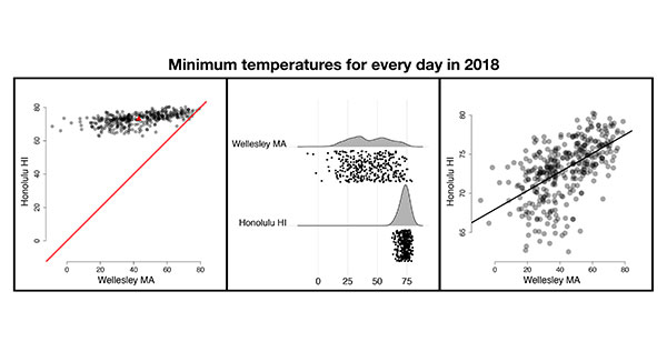
Photo: In one image, Jeremy Wilmer used the app to visualize daily minimum temperatures (°F) for every day in 2018 in Wellesley and Honolulu.


